A baker’s dozen lettering pens
2020.03.07
- Initial version, replaces the old Mojo lettering pens
[disabled link]
2020.03.09
- Disabled Dropbox links due to technical trouble
2020.03.21
- Added lettering pen 13, SINISTER
- ZIP file instead of bundle
- Google Drive instead of Dropbox
Of course a brush/pen/preset can’t do your thinking for you. If you’re new to hand lettering comics, get some lettering tips from Nat Piekos of Blambot fame.
Angle and Amble
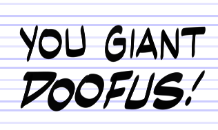
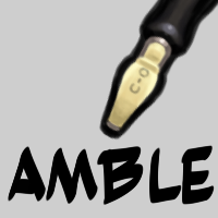
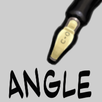
The names are arranged to maintain certain groupings, particularly when there is a normal/bold pairing of pens. Angle and Amble are meant to imitate to some degree the decorative lettering found in comics by Walt Kelly and Will Eisner. Switch from Angle to Amble for bold text; it is not simply one pen bumped up in size, but a slight adjustment in ratio for (I hope) the most pleasing look.
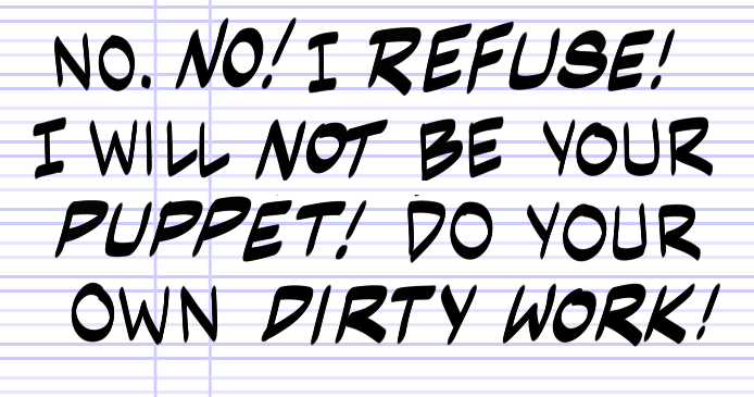
Be sure to give this type of lettering a fair amount of breathing space. We recommend the Kurio Dreamer template, which includes a lettering guide based on spacing from Eisner’s work.
Average, Bold, and Giant
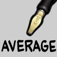
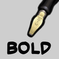
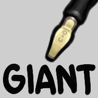
This is intended to be the most typical line for comic book dialogue. Use Average for normal text, Bold for emphasis, and Giant for exclamations.
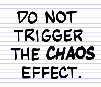
As with Angle and Amble, simply switch between Average and Bold for typical dialogue. Use the Fantastic template for classic spacing, and Triumph for tighter text. As you can see here, you can also moderate your text size and spacing with the midway lines.
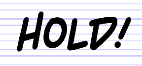
Giant will generally require a bit more space. Like Angle and Amble, these three lettering pens are not merely different brush sizes, but are also slightly adjusted for the best look.
The rest of the lettering pens are intended more for titles, special effects, and novelty. Most of them don’t require an explanation so much as experimentation, to see what you can do with them.
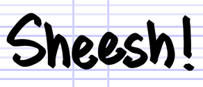
Jerk
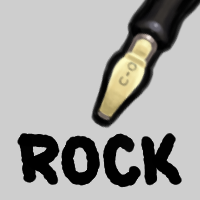
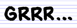
Rock
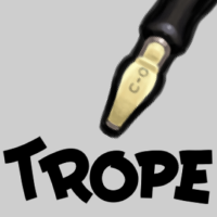
Trope
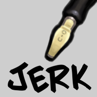
This is the most difficult and potentially dangerous lettering pen in the set. To achieve the blocky look, the pen relies on the direction of your stroke. This means that you’ll need to move the stylus in the right direction a bit before applying just the right pressure. You’ll need to practice with it to get the feel, and be prepared to redo letters as many times as necessary to get just the right look.
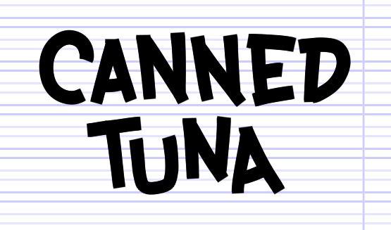
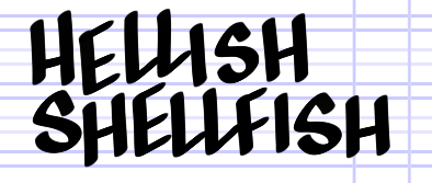
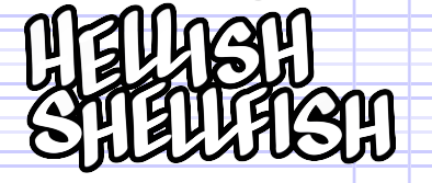
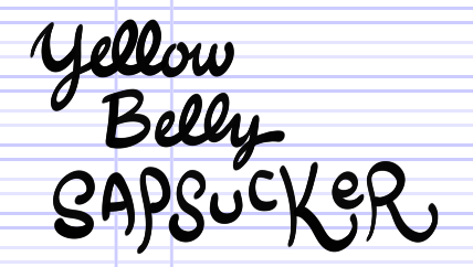
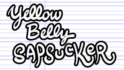
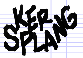
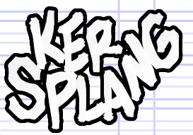
Many of the decorative lettering look particularly nice in outline form. It’s easy to do with Krita. [Link to demo to come]
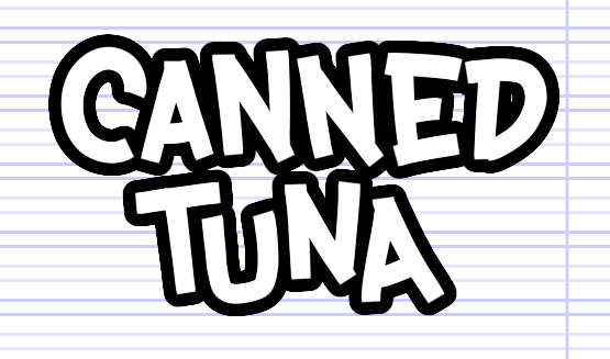
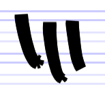
Just watch out for these odd extrusions that may occur at either end of the line. Be prepared to undo and redraw bad strokes.
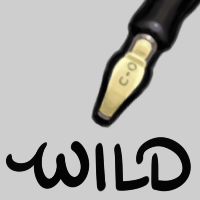
Wild
This one is a hybrid of a bevel-edged type nib and brush. It leans towards a particular angle, but you can adjust the width of line with pressure.
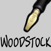
Woodstock
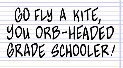
A fountain pen, basically.
Wreck
Zap
